
-
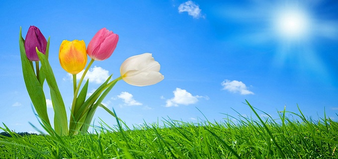
Green
-
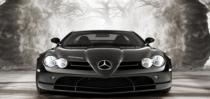
Car
-
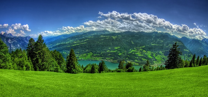
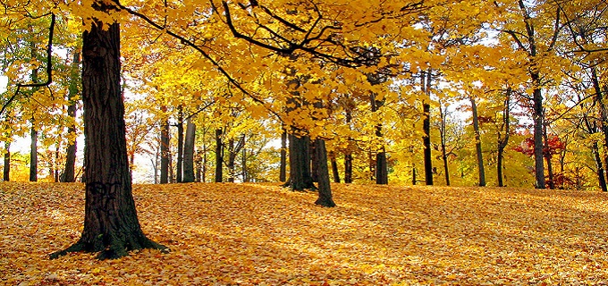
Nature
-
Nsture
-
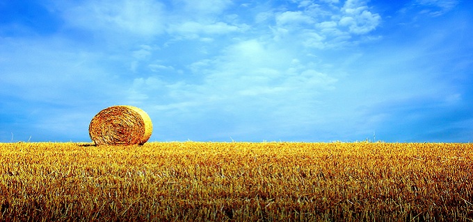
Yellow
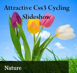
Today, im gonna explain How to add attractive Cycling slideshow for blogger.Its included back
loading bar for every image.So it will make your blog attractive.You can change your image link as your link. make sure you have to use some pixel images.Try to add to your blog. its easy. Get my
earlier slideshow post here
Demo
1. Log in to blogger account and Click drop down.
 2. Now select "Template" Like Below.

3. Now you can see Live on blog, Click EDIT HTML Button"
4. Now click Proceed button.
5. Find this tag by using Ctrl+F ]]></b:skin>
6. Paste below code Before ]]></b:skin> tag
7. Go to blogger and click Layout
8. Click Add Gadget and select 'HTML/Javascript
9. Paste below code.
10. Now save your HTML/Javascript'.
You are done...
loading bar for every image.So it will make your blog attractive.You can change your image link as your link. make sure you have to use some pixel images.Try to add to your blog. its easy. Get my
earlier slideshow post here

1. Log in to blogger account and Click drop down.
3. Now you can see Live on blog, Click EDIT HTML Button"
4. Now click Proceed button.
5. Find this tag by using Ctrl+F ]]></b:skin>
6. Paste below code Before ]]></b:skin> tag
/* fade slider www.bloggertrix.com*/
.content h1 {
 font-size:48px;
 color:#000;
 text-shadow:0px 1px 1px #f4f4f4;
 text-align:center;
 padding:60px 0 30px;
}

/* LAYOUT */
.container {
 margin:0 auto;
 overflow:hidden;
 width:960px;
}

/* CONTENT SLIDER */
#content-slider {
 width:100%;
 height:360px;
 margin:10px auto 0;
}
/* SLIDER */
#slider {
 background:#000;
 border:5px solid #eaeaea;
 box-shadow:1px 1px 5px rgba(0,0,0,0.7);
 height:270px;
 width:480px;
 margin:40px auto 0;
 overflow:visible;
 position:relative;
}
#mask {
 overflow:hidden;
 height:320px;
}
#slider ul {
 margin:0;
 padding:0;
 position:relative;
}
#slider li {
 width:480px;
 height:270px;
 position:absolute;
 top:-325px;
 list-style:none;
}

#slider li.firstanimation {
 -moz-animation:cycle 25s linear infinite;
 -webkit-animation:cycle 25s linear infinite;
}
#slider li.secondanimation {
 -moz-animation:cycletwo 25s linear infinite;
 -webkit-animation:cycletwo 25s linear infinite;
}
#slider li.thirdanimation {
 -moz-animation:cyclethree 25s linear infinite;
 -webkit-animation:cyclethree 25s linear infinite;
}
#slider li.fourthanimation {
 -moz-animation:cyclefour 25s linear infinite;
 -webkit-animation:cyclefour 25s linear infinite;
}
#slider li.fifthanimation {
 -moz-animation:cyclefive 25s linear infinite;
 -webkit-animation:cyclefive 25s linear infinite;
}

#slider .tooltip {
 background:rgba(0,0,0,0.7);
 width:300px;
 height:60px;
 position:relative;
 bottom:75px;
 left:-320px;
 -moz-transition:all 0.3s ease-in-out;
 -webkit-transition:all 0.3s ease-in-out;
}
#slider .tooltip h1 {
 color:#fff;
 font-size:24px;
 font-weight:300;
 line-height:60px;
 padding:0 0 0 20px;
}
#slider li#first:hover .tooltip,
#slider li#second:hover .tooltip,
#slider li#third:hover .tooltip,
#slider li#fourth:hover .tooltip,
#slider li#fifth:hover .tooltip {
 left:0px;
}
#slider:hover li,
#slider:hover .progress-bar {
 -moz-animation-play-state:paused;
 -webkit-animation-play-state:paused;
}

/* PROGRESS BAR */
.progress-bar {
 position:relative;
 top:-5px;
 width:480px;
 height:5px;
 background:#000;
 -moz-animation:fullexpand 25s ease-out infinite;
 -webkit-animation:fullexpand 25s ease-out infinite;
}

/* ANIMATION */
@-moz-keyframes cycle {
 0%  { top:0px; }
 4%  { top:0px; }
 16% { top:0px; opacity:1; z-index:0; }
 20% { top:325px; opacity:0; z-index:0; }
 21% { top:-325px; opacity:0; z-index:-1; }
 92% { top:-325px; opacity:0; z-index:0; }
 96% { top:-325px; opacity:0; }
 100%{ top:0px; opacity:1; }

}
@-moz-keyframes cycletwo {
 0%  { top:-325px; opacity:0; }
 16% { top:-325px; opacity:0; }
 20% { top:0px; opacity:1; }
 24% { top:0px; opacity:1; }
 36% { top:0px; opacity:1; z-index:0; }
 40% { top:325px; opacity:0; z-index:0; }
 41% { top:-325px; opacity:0; z-index:-1; }
 100%{ top:-325px; opacity:0; z-index:-1; }
}
@-moz-keyframes cyclethree {
 0%  { top:-325px; opacity:0; }
 36% { top:-325px; opacity:0; }
 40% { top:0px; opacity:1; }
 44% { top:0px; opacity:1; }
 56% { top:0px; opacity:1; }
 60% { top:325px; opacity:0; z-index:0; }
 61% { top:-325px; opacity:0; z-index:-1; }
 100%{ top:-325px; opacity:0; z-index:-1; }
}
@-moz-keyframes cyclefour {
 0%  { top:-325px; opacity:0; }
 56% { top:-325px; opacity:0; }
 60% { top:0px; opacity:1; }
 64% { top:0px; opacity:1; }
 76% { top:0px; opacity:1; z-index:0; }
 80% { top:325px; opacity:0; z-index:0; }
 81% { top:-325px; opacity:0; z-index:-1; }
 100%{ top:-325px; opacity:0; z-index:-1; }
}
@-moz-keyframes cyclefive {
 0%  { top:-325px; opacity:0; }
 76% { top:-325px; opacity:0; }
 80% { top:0px; opacity:1; }
 84% { top:0px; opacity:1; }
 96% { top:0px; opacity:1; z-index:0; }
 100%{ top:325px; opacity:0; z-index:0; }
}

@-webkit-keyframes cycle {
 0%  { top:0px; }
 4%  { top:0px; }
 16% { top:0px; opacity:1; z-index:0; }
 20% { top:325px; opacity:0; z-index:0; }
 21% { top:-325px; opacity:0; z-index:-1; }
 50% { top:-325px; opacity:0; z-index:-1; }
 92% { top:-325px; opacity:0; z-index:0; }
 96% { top:-325px; opacity:0; }
 100%{ top:0px; opacity:1; }

}
@-webkit-keyframes cycletwo {
 0%  { top:-325px; opacity:0; }
 16% { top:-325px; opacity:0; }
 20% { top:0px; opacity:1; }
 24% { top:0px; opacity:1; }
 36% { top:0px; opacity:1; z-index:0; }
 40% { top:325px; opacity:0; z-index:0; }
 41% { top:-325px; opacity:0; z-index:-1; }
 100%{ top:-325px; opacity:0; z-index:-1; }
}
@-webkit-keyframes cyclethree {
 0%  { top:-325px; opacity:0; }
 36% { top:-325px; opacity:0; }
 40% { top:0px; opacity:1; }
 44% { top:0px; opacity:1; }
 56% { top:0px; opacity:1; z-index:0; }
 60% { top:325px; opacity:0; z-index:0; }
 61% { top:-325px; opacity:0; z-index:-1; }
 100%{ top:-325px; opacity:0; z-index:-1; }
}
@-webkit-keyframes cyclefour {
 0%  { top:-325px; opacity:0; }
 56% { top:-325px; opacity:0; }
 60% { top:0px; opacity:1; }
 64% { top:0px; opacity:1; }
 76% { top:0px; opacity:1; z-index:0; }
 80% { top:325px; opacity:0; z-index:0; }
 81% { top:-325px; opacity:0; z-index:-1; }
 100%{ top:-325px; opacity:0; z-index:-1; }
}
@-webkit-keyframes cyclefive {
 0%  { top:-325px; opacity:0; }
 76% { top:-325px; opacity:0; }
 80% { top:0px; opacity:1; }
 84% { top:0px; opacity:1; }
 96% { top:0px; opacity:1; z-index:0; }
 100%{ top:325px; opacity:0; z-index:0; }
}

/* ANIMATION BAR */
@-moz-keyframes fullexpand {
    0%, 20%, 40%, 60%, 80%, 100% { width:0%; opacity:0; }
    4%, 24%, 44%, 64%, 84% { width:0%; opacity:0.3; }
   16%, 36%, 56%, 76%, 96% { width:100%; opacity:0.7; }
   17%, 37%, 57%, 77%, 97% { width:100%; opacity:0.3; }
   18%, 38%, 58%, 78%, 98% { width:100%; opacity:0; }
}
@-webkit-keyframes fullexpand {
    0%, 20%, 40%, 60%, 80%, 100% { width:0%; opacity:0; }
    4%, 24%, 44%, 64%, 84% { width:0%; opacity:0.3; }
   16%, 36%, 56%, 76%, 96% { width:100%; opacity:0.7; }
   17%, 37%, 57%, 77%, 97% { width:100%; opacity:0.3; }
   18%, 38%, 58%, 78%, 98% { width:100%; opacity:0; }
}
7. Go to blogger and click Layout
8. Click Add Gadget and select 'HTML/Javascript
9. Paste below code.
<div class="container">
 <div id="content-slider">
     <div id="slider">
         <div id="mask">
            <ul>
            <li id="first" class="firstanimation">
            <a href="#">
             <img src="https://blogger.googleusercontent.com/img/b/R29vZ2xl/AVvXsEh6j-cD2tngnpygRniBLHNP82FGjbdrd2ic24ejnAKcqwDbWLeF9_eyIyDwKI_bLi7rrA_wXiX-pHBFymxM_A49JBf9aavay-iQ7U94GJ3AI2YN7qPgPREgqVWYjnS_zDxLO1k60p4pya6h/s1600/green.jpg" alt="Green"/>
            </a>
            <div class="tooltip">
            <h1>Green</h1>
            </div>
            </li>

            <li id="second" class="secondanimation">
            <a href="#">
            <img src="https://blogger.googleusercontent.com/img/b/R29vZ2xl/AVvXsEjIEI5WkzlH9t1HHOGglqW-z_GU2NXKUiR2dYT0ggH_p84cP40Ew9xe_8L7XKCZz9M37G8VtyjBnPhTh3niGeAlJrU1Y5qjGLLsOyQJ8kUxunbBJy-qyq1XC6AVrD0BFk5KzbXwygR2mLJX/s1600/wallpapers-1.jpg" alt="Car"/>
            </a>
            <div class="tooltip">
            <h1>Car</h1>
            </div>
            </li>

            <li id="third" class="thirdanimation">
            <a href="#">
            <img src="https://blogger.googleusercontent.com/img/b/R29vZ2xl/AVvXsEhgFjmefeqbmf1x6amPdVllqDojBCPWNbVcWKRwT_rkdMzVo46gHvlSgdTIaUd_eOFAhE1Zujxm-QzwCz7ZRCQZxwASlBUZIIqrTgtL90tej-ePYRBcaPw90tIrEvqCU3eVjZOs7PBEgpDN/s1600/nature2.jpg" alt="Nature"/>
            </a>
            <div class="tooltip">
            <h1>Nature</h1>
            </div>
            </li>

            <li id="fourth" class="fourthanimation">
            <a href="#">
             <img src="https://blogger.googleusercontent.com/img/b/R29vZ2xl/AVvXsEhNsBwkJVL18KujLsc3DIzxTpzx_HFUMY_KxDNlLvoyPItQ5ZjYzhmpaM73vqDCDiL5SEp5omP8I8YN2L9YxVUmczGdPt6PC1b01fydt2zHbTwIqRO3Fej23004tuI6o6YFVRMWBe0CKmtR/s1600/nature.jpg" alt="Nature"/>
            </a>
            <div class="tooltip">
            <h1>Nsture</h1>
            </div>
            </li>

            <li id="fifth" class="fifthanimation">
            <a href="#">
            <img src="https://blogger.googleusercontent.com/img/b/R29vZ2xl/AVvXsEiMBZjat6heZuhCki7tq9_9OodlR3b_r4qjYXQqDs9xCAEqyLVjVXH7_DfXI0b1vOfe9Ev03BkAr4dK5xwy_Tdr1UsZORSNfl4hpxQuEBIU6g0BjPpq-zAByoeug6OsLbjJCEErcu24C_fR/s1600/nature3.jpg" alt="Yellow"/>
            </a>
            <div class="tooltip">
            <h1>Yellow</h1>
            </div>
            </li>
            </ul>
            </div>
            <div class="progress-bar"></div>
        </div>
    </div>
</div>
Replace image links.10. Now save your HTML/Javascript'.
You are done...

Không có nhận xét nào:
**Đăng nhận xét